#install.packages(c("tidygraph","ggraph", "skimr"))
library(tidyverse)
library(tidygraph)
library(ggraph)
library(skimr) # produce descriptive statistic summariesNetwork visualization
Session 4b
1 Visualization
ggraph is an R package that extends the powerful grammar of graphics framework of ggplot2 to enable the visualization of network data.
Just as ggplot2 provides a structured approach to creating visualizations for tabular data, ggraph offers a similar grammar for creating visualizations of networks. It seamlessly integrates with the tidygraph package.
With ggraph, we have access to a wide range of geoms specifically designed for drawing nodes and edges, as well as various layout algorithms to customize the appearance of the network graphs.
1.1 A basic graph
In the following, we continue use Harry Potter peer-support network as examples to show the grammars of ggraph. To start with, we specify the graph object (i.e., hp.6_no_self) to be visualized and the layout algorithm to be used for arranging the nodes in the visualization.
The “nicely” layout is a convenient choice as it automatically selects an appropriate layout based on the structure of the input graph. However, you can replace “nicely” with other layout options such as “circle”, “fr”, “kk”, and others, depending on your graph’s characteristics and desired visual arrangement. You can check out the details of the layout options using ?ggraph and here.
The second and third functions,geom_edge_link() and geom_node_point() add the edges and nodes to the visualization.
At last, we use geom_node_text(aes(label = name)) to add text labels to each node. In here, we use the “name” attribute of each node for labeling.
load("hp.6_no_self.RData")

ggraph(hp.6_no_self,
       layout = "nicely") +
  geom_edge_link() +
  geom_node_point() +
  geom_node_text(aes(label = name))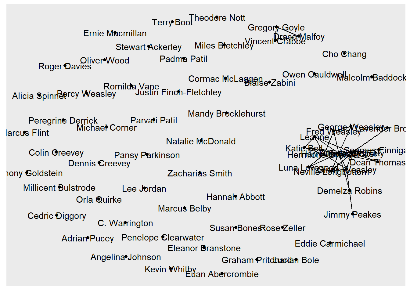
1.2 More specifications
The basic graph visualization we created serves the purpose of showing the connections between nodes but lacks some important information and visual enhancements. For instance, this graph shows no tie direction that we can tell who offered help and who received help.
In the following work, we create a better graph that adds the directionality to the edges to indicate who offered help to whom. We’ll also vary the node size based on the out-degree centrality to highlight the most active helpers. Additionally, we’ll use color and shape to distinguish nodes based on their house affiliation and gender.
I also removed the characters that were either non-help givers or receivers for visualization purpose. This decision to remove isolated nodes should be made based on your specific network context and research questions. In many cases, the presence of isolated actors in a network can provide valuable information and insights.
Furthermore, we’ll adjust the edge transparency based on edge betweenness, which measures the number of shortest paths that pass through an edge, indicating its importance in connecting different parts of the network.
Finally, I want to spread out the edge lines to avoid stacking, which could be mistaken for the tie strength and make some ties invisible. Commonly, we could add curvature to the edges and reduce overlap, you can use geom_edge_fan() instead of geom_edge_link(). The geom_edge_fan() function allows you to control the curvature and spread of the edges.
1.2.1 Prepare data
Now we have a plan how to improve the network visualization. Before actually plotting, we can prepare the data with the attributes of nodes and edges to be added. In our case, we create the nodes’ out- and in-degrees and edges’ betweenness variables using the dplyr verbs.
hp.6.connected<-hp.6_no_self %>%
  activate(nodes) %>%
  mutate(out_degree = centrality_degree(mode = "out"),
         in_degree = centrality_degree(mode = "in")
         ) %>%
   filter(in_degree!=0|out_degree!=0) %>%
    activate(edges) %>%
  mutate(edge_betweenness =centrality_edge_betweenness())
We can quickly compute the descriptive statistics of the edge and node attributes, which help us modify the graph appearance. Here, I introduce a new package skimr to do this task.
require(skimr)

hp.6.connected %>%
  activate(nodes) %>%
skim() | Name | Piped data |
| Number of rows | 18 |
| Number of columns | 6 |
| _______________________ | |
| Column type frequency: | |
| character | 3 |
| numeric | 3 |
| ________________________ | |
| Group variables | None |
Variable type: character
| skim_variable | n_missing | complete_rate | min | max | empty | n_unique | whitespace |
|---|---|---|---|---|---|---|---|
| name | 0 | 1 | 6 | 18 | 0 | 18 | 0 |
| gender | 0 | 1 | 4 | 6 | 0 | 2 | 0 |
| house | 0 | 1 | 9 | 10 | 0 | 4 | 0 |
Variable type: numeric
| skim_variable | n_missing | complete_rate | mean | sd | p0 | p25 | p50 | p75 | p100 | hist |
|---|---|---|---|---|---|---|---|---|---|---|
| schoolyear | 0 | 1 | 1991.11 | 1.18 | 1989 | 1991 | 1991.0 | 1991 | 1994 | ▂▇▂▁▁ |
| out_degree | 0 | 1 | 2.94 | 2.75 | 0 | 1 | 2.5 | 3 | 10 | ▇▅▂▁▁ |
| in_degree | 0 | 1 | 2.94 | 2.31 | 0 | 2 | 2.0 | 4 | 9 | ▃▇▃▁▁ |
hp.6.connected %>%
  activate(edges) %>%
skim(edge_betweenness) | Name | Piped data |
| Number of rows | 53 |
| Number of columns | 4 |
| _______________________ | |
| Column type frequency: | |
| numeric | 1 |
| ________________________ | |
| Group variables | None |
Variable type: numeric
| skim_variable | n_missing | complete_rate | mean | sd | p0 | p25 | p50 | p75 | p100 | hist |
|---|---|---|---|---|---|---|---|---|---|---|
| edge_betweenness | 0 | 1 | 4.43 | 2.9 | 1 | 2.33 | 3.83 | 6.33 | 13 | ▇▆▃▂▁ |
Note
Note that, the betweeness of edges is slightly different than the betweeness of nodes. Node betweenness measures the number of shortest paths that pass through a node, indicating its importance in connecting different parts of the network.
On the other hand, edge betweenness measures the number of shortest paths that pass through an edge, indicating its importance in maintaining connectivity and flow within the network. In this case, an edge with an high betweenness is likely a bridge between two different communities and, by definition, a weak link. Let’s see if this is the case in this peer-support network.
ggraph(hp.6.connected, layout = "kk") +
  geom_edge_fan(aes(alpha = (edge_betweenness + 5)# rescale
                     ),
                 arrow = arrow(type="closed",
                               length = unit(2,"mm"), #the length of the arrow head
                               angle = 20 #the width of the arrow head
                               ),
                 end_cap = circle(3, "mm"), # the edges end at a distance of 3mm to avoid overly on node points
                 curve_width = 0.8, # control the curvature of the edges
                spread = 0.8 # control the spread of the edges
  )+

  geom_node_point(aes(size = out_degree*1.5,
                      color = house,
                      shape = gender),
                  alpha=0.7) +
  geom_node_text(aes(label = name),
                 repel = TRUE, # avoid label overlapping
                 size = 3) +
  scale_color_manual(values = c("Gryffindor" = "#740001",
                                "Slytherin" = "#1a472a",
                                "Ravenclaw" = "#0e1a40",
                                "Hufflepuff" = "#ecb939")) +
  scale_shape_manual(values = c("male" = 16, "female" = 17)) +
  guides(size=FALSE, edge_alpha=FALSE) + # I don't want to show the legends for edge alpha and node size, so I set them to be "FALSE". While I keep the lengends for nodes color and shape.
   labs(color = "House",
       shape = "Gender",
       caption = "Note. The shades of edge represents edge betweenness. The size of nodes represents out-degree.") +
  theme_graph()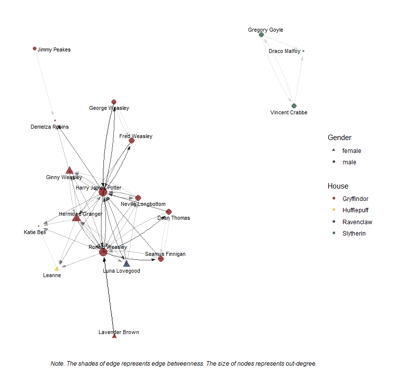
Activity
With the added specifications, the network graph improved extensively, showing many important information about this network. Let’s interpret this peer-support network using the questions provided below.
What do the nodes, edges, arrows, colors, and sizes represent in the plot?
Who are the most central or important nodes in the network based on their size (out-degree)?
What does it mean for a character to have a high out-degree in a peer-support network?
Who are the most active help-giver? And Who helped each other?
Based on the node colors, can you identify any clusters or communities within the network?
How might the house affiliation influence the support relationships among students?
What role does homophily (the tendency for individuals to associate with similar others) play in shaping the network structure?
You may think that some of these questions are difficult to tell based on the current graph, or some information is still missing. Yes, this graph is not perfect. There are many other things we can improve it. However, the improvement should be based on your understanding of this network. That is, before any modifications made to the graph, you should think why you are doing these.
2 Interactive visualization
There a few R packages help make interactive (or even dynamic) networks. In this section, we’ll focus on the visNetwork package, which allows you to create interactive networks with features such as zooming, highlighting, and selecting nodes and edges. It provides a user-friendly interface for customizing the appearance of nodes and edges, adding tooltips, and enabling various interactive behaviors.
The steps of using visNetwork to create interactive network visualizations are clear. First, we need to convert the tidygraph object into a format compatible with visNetwork. Then, we prepare the node and edge data in the format required by visNetwork. Finally, we can create the visNetwork object using the visNetwork() function and customize it as needed.
The following provides a simple example of creating a interactive peer-support network following these steps. I keep the specifications for the node and edges as we did in the above static graph.
Let’s load the necessary packages first.
# install.packages("visNetwork")

library(tidygraph)
library(visNetwork)
Warning: package 'visNetwork' was built under R version 4.3.32.1 Prepare data
visNetwork expects the data to be provided as two separate data frames: one for nodes and one for edges. When preparing these data sets, we also can modify the node and edge data frames to include the necessary columns for the appearance specification.
For instance, the column label is used for setting the label size. Then we need to create a variable label to define our node’s label in the node data. See codes below.
node_data <- hp.6.connected %>%
  activate(nodes) %>%
  as_tibble() %>% # convert to a data frame
  mutate(id = row_number(), # create a unique ID for each node
         label = name, # use the 'name' column as the node label
         value = out_degree, # set the node size based on out-degree
         shape = ifelse(gender == "male", "square", "circle"), # set the node shape based on gender
         group = house, # set the node color based on house
         color.background = case_when(house=="Gryffindor" ~ "#740001",
                                      house=="Slytherin" ~ "#1a472a",
                                      house=="Ravenclaw" ~ "#0e1a40",
                                      house=="Hufflepuff" ~ "#ecb939")# set the house colors
         )

glimpse(node_data)
Rows: 18
Columns: 12
$ name <chr> "Dean Thomas", "Demelza Robins", "Draco Malfoy", "Fre…
$ schoolyear <int> 1991, 1993, 1991, 1989, 1989, 1992, 1991, 1991, 1991,…
$ gender <chr> "male", "female", "male", "male", "male", "female", "…
$ house <chr> "Gryffindor", "Gryffindor", "Slytherin", "Gryffindor"…
$ out_degree <dbl> 3, 0, 0, 3, 2, 5, 2, 10, 6, 1, 0, 1, 1, 3, 3, 8, 3, 2
$ in_degree <dbl> 2, 3, 2, 2, 2, 4, 1, 9, 5, 0, 4, 0, 3, 2, 4, 7, 2, 1
$ id <int> 1, 2, 3, 4, 5, 6, 7, 8, 9, 10, 11, 12, 13, 14, 15, 16…
$ label <chr> "Dean Thomas", "Demelza Robins", "Draco Malfoy", "Fre…
$ value <dbl> 3, 0, 0, 3, 2, 5, 2, 10, 6, 1, 0, 1, 1, 3, 3, 8, 3, 2
$ shape <chr> "square", "circle", "square", "square", "square", "ci…
$ group <chr> "Gryffindor", "Gryffindor", "Slytherin", "Gryffindor"…
$ color.background <chr> "#740001", "#740001", "#1a472a", "#740001", "#740001"…Similarly, we define the arguments for edge appearance. Here, I only define the edge width and arrow direction.
edge_data <- hp.6.connected %>%
  activate(edges) %>%
  as_tibble() %>%
  mutate(width = (edge_betweenness + 1)/2.5, # set the edge width based on betweenness
         arrows = "to") %>%
  select(from, to, width, arrows)

glimpse(edge_data)
Rows: 53
Columns: 4
$ from <int> 1, 1, 1, 4, 4, 4, 5, 5, 6, 6, 6, 6, 6, 7, 7, 8, 8, 8, 8, 8, 8, …
$ to <int> 8, 16, 17, 5, 8, 9, 4, 8, 2, 8, 9, 15, 16, 3, 18, 2, 4, 5, 6, 9…
$ width <dbl> 3.400000, 1.800000, 0.800000, 0.800000, 3.000000, 2.400000, 1.0…
$ arrows <chr> "to", "to", "to", "to", "to", "to", "to", "to", "to", "to", "to…You might ask how can I know the arguments? Hold that question since we will show the answervery soon.
2.2 Create visNetwork object
Now, we can create the visNetwork object using the node and edge data sets we just created.
visNetwork(nodes = node_data, edges = edge_data)See that these pre-defined arguments for node and edge appearance show in this basic interactive graph!
You can further modify the appearances of nodes and edges through visNodes() and visEdges(), respectively. By checking the help documentations of these two functions, you may notice many arguments are available to modify the network appearances. You can set the arguments when preparing the node and edge data and in the visNetwork object modification.
In below, we modify the color and font size of the node labels and the curves of edge lines.
visnet_hp.6<-visNetwork(nodes = node_data, edges = edge_data) %>%
  visNodes(color = list(
      background = "#eeefff",  # set the background color of nodes
      border = "black",  # set the border color of nodes
      highlight = "#E66100"  # set the color of nodes when highlighted
    ),
    font = list(
      size = 12,  # set the font size of node labels
      color = "black"  # set the font color of node labels
    )
  ) %>%
  visEdges(
    color = list(
      color = "gray",  # set the default color of edges
      highlight = "#D35FB7"  # set the color of edges when highlighted
    ),
    smooth = list(
      enabled = TRUE,  # enable curved edges
      type = "curvedCW"  # set the type of curve (clockwise)
    )
  ) %>%
  visLayout(randomSeed = 123)  # set a random seed for consistent layout

visnet_hp.6
2.3 More modifications
Of course, there are many other options for making this network more interactive. See a few examples below.
visnet_hp.6<-visOptions(visnet_hp.6,
                        width="100%",
 #                       height="100%",
                        highlightNearest =list(enabled = T,
                                               hover = T),
                        selectedBy = "label")%>%
  visInteraction(navigationButtons = TRUE)

visnet_hp.6
You can continue working on modifying this network graph until it satisfy your need.
With the beautiful work you made, we can export this it into a html file using visSave(). You can view this network in web browser and show it off to your friends!
visSave(visnet_hp.6, file = "visnet_hp.6.html")3 Word co-occurrence networks
Word co-occurrence networks (WCNs) provide insights into the relationships between words in a text corpus. In these networks, nodes represent words, and edges represent the co-occurrence or connection between words. The strength of the connection is often determined by the frequency of co-occurrence within a specified window size (e.g., adjacent words or words within a certain distance).
Edges in a WCN indicate that two words appear together within a specified context or window. For example, if the words “economic” and “growth” frequently appear within a window of 5 words in the text, there will be an edge between these two nodes in the network. The presence of an edge suggests a semantic or contextual relationship between the connected words.
Researchers use WCNs to identify themes, topics, and semantic relationships within the text data. The following instruction introduces how to create WCNs using the State of the Union (SOTU) speeches data set. Further, we compare the WCNs for the speeches of Barack Obama and Donald Trump. To do this, we will use the quanteda, tidygraph, and ggraph packages.
First, let’s load the required packages and the data.
library(quanteda)
library(tidygraph)
library(ggraph)
library(tidyverse)
library(skimr)


# load data
library(sotu)
sotu_meta<-sotu_meta
sotu_text<-sotu_text
sotu_meta %>% distinct(president) %>% tail() president
37 Ronald Reagan
38 George Bush
39 William J. Clinton
40 George W. Bush
41 Barack Obama
42 Donald Trump3.1 Preprocessing and tokenization
Following the quanteda framework, we first need convert the sotu data into a corpus object. We then use the corpus_subset function to filter the speeches from Barack Obama and Donald Trump. Finally, we convert the corpus object to tokens and conduct the tokenization and preprocessing. We have learned these in Module 3 and practiced all these steps in R Ex. 3 :)
sotu_tokens <- corpus(sotu_text,docvars=sotu_meta) %>%
 # corpus_subset(president %in% c("Barack Obama", "Donald Trump")) %>%
  tokens(remove_punct = TRUE,
         remove_symbols = TRUE,
         remove_numbers = TRUE) %>%
  tokens_tolower() %>%
tokens_remove(c(stopwords("en"), "can", "also", "just"))head(sotu_tokens)Tokens consisting of 6 documents and 6 docvars.
text1 :
[1] "fellow-citizens" "senate" "house" "representatives"
[5] "embrace" "great" "satisfaction" "opportunity"
[9] "now" "presents" "congratulating" "present"
[ ... and 486 more ]
text2 :
[1] "fellow-citizens" "senate" "house" "representatives"
[5] "meeting" "feel" "much" "satisfaction"
[9] "able" "repeat" "congratulations" "favorable"
[ ... and 616 more ]
text3 :
[1] "fellow-citizens" "senate" "house" "representatives"
[5] "vain" "may" "expect" "peace"
[9] "indians" "frontiers" "long" "lawless"
[ ... and 1,049 more ]
text4 :
[1] "fellow-citizens" "senate" "house" "representatives"
[5] "abatement" "satisfaction" "meet" "present"
[9] "occasion" "felicitating" "continuance" "national"
[ ... and 941 more ]
text5 :
[1] "fellow-citizens" "senate" "house" "representatives"
[5] "since" "commencement" "term" "called"
[9] "office" "fit" "occasion" "arisen"
[ ... and 879 more ]
text6 :
[1] "fellow-citizens" "senate" "house" "representatives"
[5] "call" "mind" "gracious" "indulgence"
[9] "heaven" "american" "people" "became"
[ ... and 1,315 more ]3.2 Creating the feature co-occurrence matrix
We then need to create a feature co-occurrence matrix (FCM) records the number of co-occurrences of tokens within the specified window size.
obama_fcm <- sotu_tokens %>%
  tokens_subset(president == "Barack Obama") %>%
  fcm(context = "window",
      window = 5,
      count="frequency")

trump_fcm <- sotu_tokens %>%
  tokens_subset(president == "Donald Trump") %>%
  fcm(context = "window",
      window = 5,
      count="frequency")
The window parameter in the fcm() function determines the size of the context window within which word co-occurrences are considered. It defines the maximum distance between words to be counted as co-occurring.
Window size
The window size directly affects the density of the resulting network. A smaller window size will lead to a more focused network, capturing co-occurrences between words that appear close together. This can be useful for identifying local patterns and relationships between words that occur in close proximity.
On the other hand, when you set a larger window size, the network will capture broader co-occurrence patterns, including words that appear further apart in the text. This can be helpful for identifying more global themes and associations between words that may not necessarily appear in close proximity but still have a meaningful relationship.
The choice of the window size is often an arbitrary decision made by the researcher based on the specific research question, the desired level of granularity in the analysis, the characteristics of the text, and computational power. It is often useful to experiment with different widow sizes and observe how they impact the network structure and the insights gained from the analysis.
3.3 Creating the networks
We now create the graph object based on the derived fcm. Before doing so using the as_tbl_graph function, we need to convert fcm into a matrix. Here, we also mutate the degree centrality variable, which will be used as a node weight in visualization.
obama_graph <- as_tbl_graph(as.matrix(obama_fcm),
                            directed = FALSE) %>%
  mutate(centrality = centrality_degree())
In the context of WCNs, nodes with higher centrality scores are considered more central or important based on their co-occurrence patterns. These nodes tend to have a higher number of connections (edges) to other words, suggesting their significance in the text. I kept the nodes that are most central or important for example purpose.
This approach highlights the core of the WCN and their relationships. However, it’s important to note that this exclusion might result in the omission of some interesting patterns or relationships at the periphery of the network. Again, this approach and its filtering threshold is case-by-case and depends on the specific research goals.
obama_graph %>% activate(nodes) %>%
skim(centrality)| Name | Piped data |
| Number of rows | 4979 |
| Number of columns | 2 |
| _______________________ | |
| Column type frequency: | |
| numeric | 1 |
| ________________________ | |
| Group variables | None |
Variable type: numeric
| skim_variable | n_missing | complete_rate | mean | sd | p0 | p25 | p50 | p75 | p100 | hist |
|---|---|---|---|---|---|---|---|---|---|---|
| centrality | 0 | 1 | 42.74 | 80.88 | 6 | 10 | 18 | 38 | 1104 | ▇▁▁▁▁ |
obama_graph<-obama_graph%>%
  filter(centrality > 400)
Let’s see the graph object.
obama_graph# A tbl_graph: 50 nodes and 1179 edges
#
# An undirected multigraph with 1 component
#
# Node Data: 50 × 2 (active)
name centrality
<chr> <dbl>
1 congress 582
2 first 470
3 come 404
4 tonight 631
5 us 941
6 know 733
7 many 406
8 americans 801
9 right 584
10 now 1104
# ℹ 40 more rows
#
# Edge Data: 1,179 × 3
from to weight
<int> <int> <dbl>
1 1 1 4
2 1 2 3
3 1 3 2
# ℹ 1,176 more rowsThe weight attribute in the edgelist represents the frequency or strength of the co-occurrence between two words. A higher weight indicates that the two words appear together more frequently within the specified window. We will use it to visual the strength of ties.
I use similar codes to create the graph object for the Trump’s speeches.
trump_graph <- as_tbl_graph(as.matrix(trump_fcm), directed = FALSE) %>%
  mutate(centrality = centrality_degree())


trump_graph<-trump_graph%>%
  filter(centrality > 200)

trump_graph
# A tbl_graph: 43 nodes and 714 edges
#
# An undirected multigraph with 1 component
#
# Node Data: 43 × 2 (active)
name centrality
<chr> <dbl>
1 thank 388
2 much 251
3 president 201
4 congress 322
5 first 286
6 united 360
7 states 364
8 citizens 246
9 america 521
10 tonight 480
# ℹ 33 more rows
#
# Edge Data: 714 × 3
from to weight
<int> <int> <dbl>
1 1 1 56
2 1 2 60
3 1 3 9
# ℹ 711 more rows3.4 Visualizing the networks
Finally, we can visualize the WCNs using ggraph.
ggraph(obama_graph, layout = "fr") +
  geom_edge_link(aes(edge_alpha = weight), # the strength of the co-occurrence
                 show.legend = FALSE) +
  geom_node_point(aes(size = centrality), # use size to show the degree centrality of each word
                  color = "#1A85FF", show.legend = FALSE) +
  geom_node_text(aes(label = name), size=5,
                 repel = TRUE, # avoid overlap of labels
                 max.overlaps = 50) # This is useful for visualizing a large and dense network. A higher value to allow for more overlapping labels if needed.
+
  ggtitle("Obama's SOTU Word Co-occurrence Network")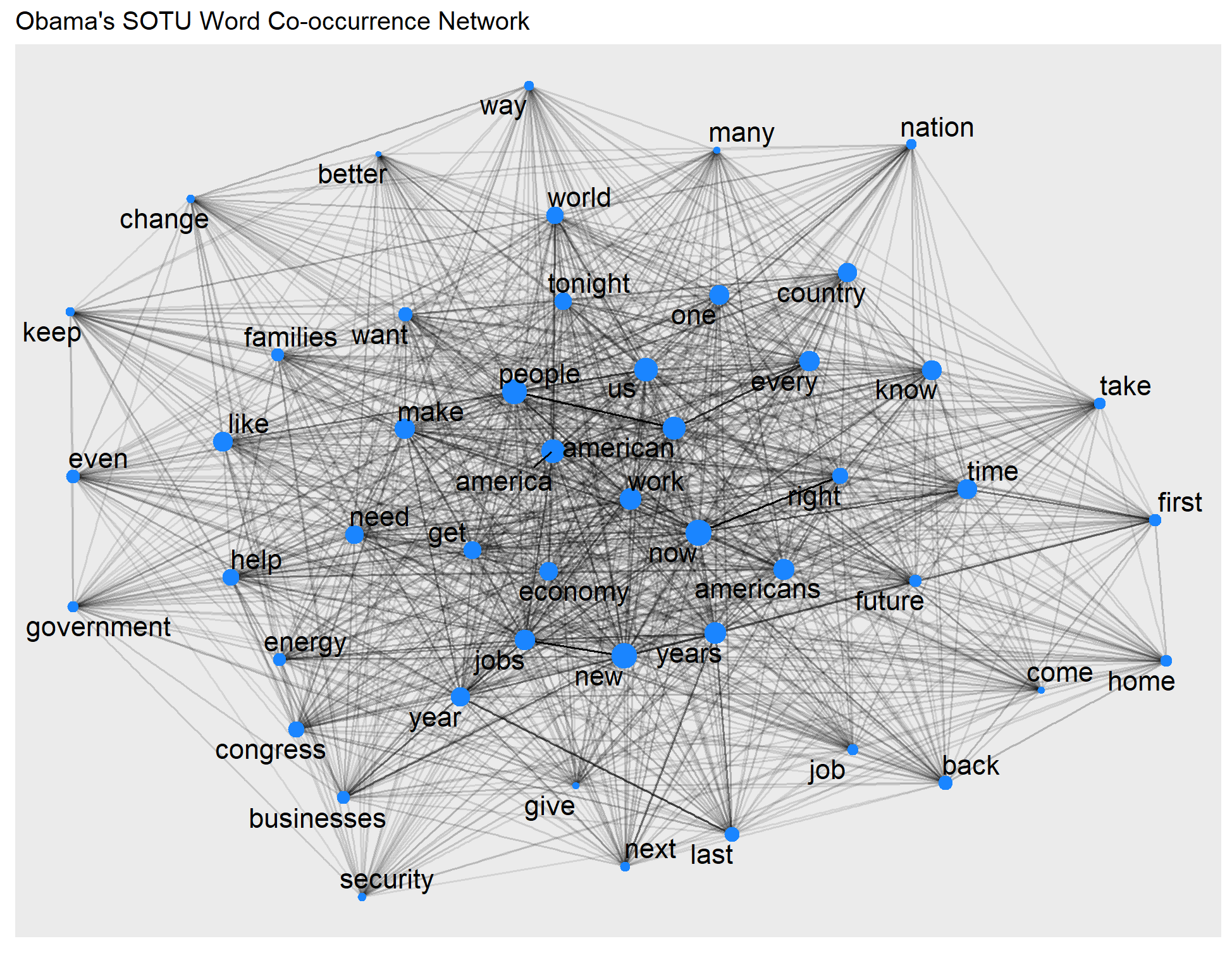
ggraph(trump_graph, layout = "fr") +
  geom_edge_link(aes(edge_alpha = weight), show.legend = FALSE) +
  geom_node_point(aes(size = centrality), color = "#D41159", show.legend = FALSE) +
  geom_node_text(aes(label = name), size=5,repel = TRUE, max.overlaps = 50) +
  ggtitle("Trump's SOTU Word Co-occurrence Network")
Unsurprisingly, both presidents’ speeches emphasize America. Any unique patterns in rhetorical style, policy focus, and overarching themes you may observe?
WCNs v.s. word clouds
You might recall that we learned how to draw word clouds in the previous Section 3a of the Text-as-data module. WCNs and word clouds are both great visualization tools to show patterns in documents. What are the differences in their applications? Studying the co-occurrence of words, rather than just their individual frequencies, allows us to understand the context and relationships between words. While word frequency provides information about the importance or prominence of individual words, co-occurrence analysis reveals how words are used together and the themes or topics they form. Further, we can use network analysis to gain insights into the semantic structures of the text by examining the co-occurrence patterns.